The industry standard for Graphic Designers is Adobe Creative Cloud. Previously known as Adobe Creative Suite, this is now a subscription service that allows users to access a collection of over 20 creative applications. While you likely won't be required to be an expert in all these apps (thank goodness), the following programs are essential in a Graphic Designer's knowledge.
Primary use: edit, composite & create images
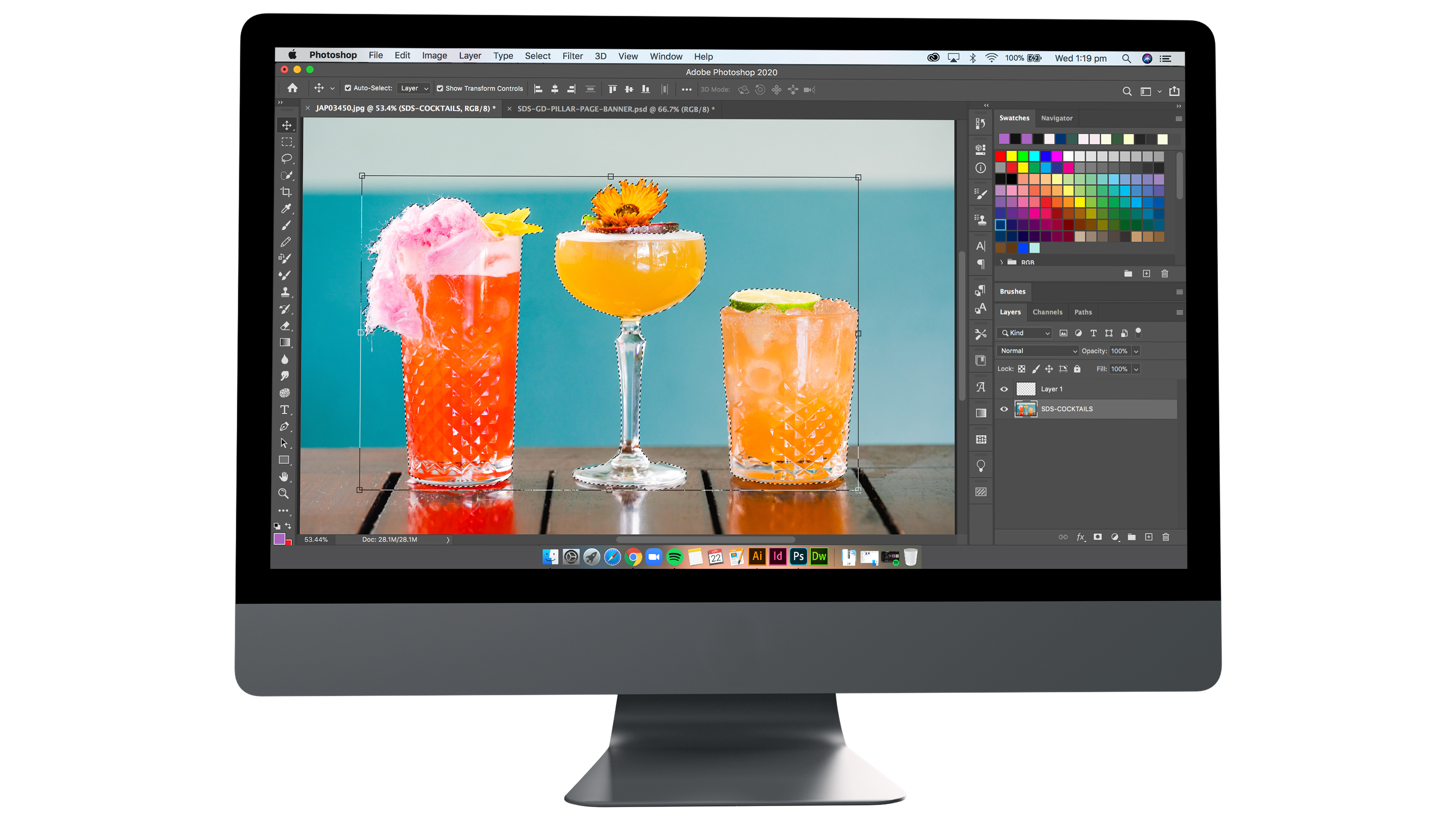
Photoshop is often the first program that budding designers dabble with, but if you're thinking you can get away with designing everything on Photoshop, you're sorely mistaken! While Photoshop has many capabilities and a very good all-rounder, you'll soon discover it does not have all the features you will need as a Graphic Designer. This is true for the rest of the programs as well.
Primary use: page design & layout for print & digital publishing
InDesign's specialty is all about layouts and text. Anything that features lots of text (think restaurant menus), or is designed to be printed (magazines, flyers, business cards, etc.) is best suited to this program.
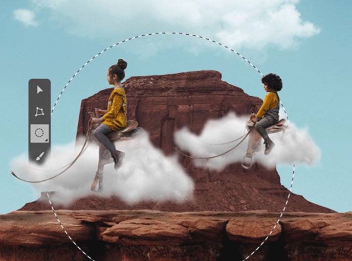
Primary use: vector graphics & illustration
It's right in the name, this program is the one you'll want to use when you're creating illustrations! Illustrator is also the king of the almighty vector. A vector graphic is comprised of paths, which are defined by a start and end point, and can have other points, curves and angles along the way. This is different to graphics you may create in Photoshop, which are made of pixels. Simply put, when you blow up (enlarge) a vector, it will still stay sharp and smooth. You could enlarge it from an icon to a billboard and it will still be crisp. A graphic made of pixels will become blurry at a certain point.
The above three applications are definitely the ones you'll want to be fluent in. However, the lines between a graphic designer and video/content creator are continually blurred, so video is becoming more and more important. You'll definitely want a basic knowledge of video editing applications as a Graphic Designer.
Both of these video applications are available in Adobe Creative Cloud for you to familiarise yourself with. Premiere Pro's main function is to edit clips together in a sequence, this makes it great for beginners. In After Effects, you can also edit sequences but it enables you to add motion graphics and visual effects.
Art may be subjective, but there are indeed some basic design principles that you should know. As they say, you need to learn the rules before you break them.
We've put this rule first, to emphasise how important it is - especially in the hospitality industry where lots of information is communicated visually. Hierarchy refers to the arrangement and presentation of elements in the order of their importance. It leads the eye through each area in a specific order.
When selecting your fonts, you want to consider the brand guidelines & the demographic you're targeting, but the one thing more important than that is legibility. Can the viewer read the message?
On the topic of fonts, a good golden rule of design is to never choose more than 3 fonts. Using too many simply looks messy and ugly.
Despite it's name, this can be any colour, texture, or perhaps a background image - it is simply the space that isn't filled with design elements. It's desirable to have white space in a design, to give us "breathing room". Too many elements and too much information is overwhelming!
This refers to placing text, images, or any other design elements in line with each other. Alignment organises your design in an orderly fashion and improves readability.
When you're a Graphic Designer, you're also a copywriter. It's human to make a few typos here and there, but you can save yourself from multiple revisions by proofreading. Not your forte? Try using proofreading software such as Grammarly.
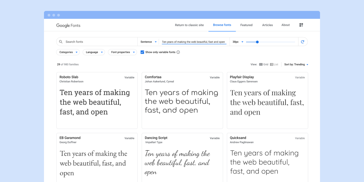
Once you start digging in to software, you'll be in need of some resources. With the world wide web being as big as it is, there is no shortage of free resources. Here's a few of the best.
* Always make sure the images & fonts you are using are cleared for commercial use!
It's beneficial to keep an eye on hospitality trends, as these extend into graphic design. For example, are all the newest restaurants featuring expanded text or bright neon colours? These are all elements that you can incorporate into your designs to boost the relevancy of the work.
As social media platforms constantly evolve and change as soon as we've gotten used to them, sizes and spec for graphics on social media also change.
Here are some of the most up-to-date sizes & specs as of April 2020.
Profile Picture Image/Video
1080 x 1080 (1:1)
Personal Profile Cover Photo
We recommend: 2553 x 945
Business Page Cover Photo/Video
We recommend: 2460 x 936
Event Cover Photo/Video
1920 x 1080 (16:9)
Group Cover Photo
1640 x 856
Image Post
We recommend: 1080 x up to 1620 (2:3)
Story Post
1080 x 1920 (9:16)
Profile Picture
1080 x 1080 (1:1)
Square Post
1080 x 1080 (1:1)
Portrait Post
We recommend: 1080 x 1350 (4:5)
Landscape Post
We recommend: 1080 x 608 (1.9:1)
Story
1080 x 1920 (9:16)
IGTV
1080 x 1920 or 1920 x 1080 (9:16 or 16:9)
Note: Subscribe to our blog to be notified on our soon to be published 2020 Social Media Sizes Cheatsheet!
See a full collection of creative specs and technical requirements for ads on Facebook here.
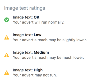
An important rule to remember with graphics in Facebook Ads is the 20% text rule. Facebook has found that images with less than 20% text perform better, so they have set up a review process in which ads with too much text in the image or video thumbnail will be rejected.
To check if your image has too much text, upload it to Facebook's Text Overlay Tool.
The tool will tell you what image rating you have, and if your ad will run normally, reach fewer people, or be rejected.
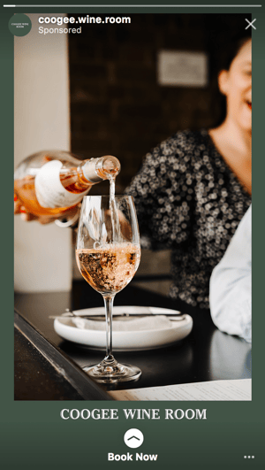
The above 20% rule also applies to Instagram & Facebook Story Ads, but there is another factor to consider. Your audience has a limited reading time, and your visual content will take most of the screen space.
The recommended resolution is 1080 x 1920 px, however this does not mean you can use the entire canvas. Design or text elements will be obstructed from both the very top and very bottom of the screen - due to the profile photo, name, 'Sponsored' text and call to action text.
As always, keep consistent with the brand guidelines when designing an email signature. Use relevant fonts, colours & imagery. Information should be kept at only the essential details, think of it as a digital business card.
Name, number, job position, company & company address are a few essentials to consider including.
An important aspect of email signature design is it's compatibility with mobile & different email clients. Your design may look great on Outlook for desktop, but will it look good on Gmail for mobile? Cross testing it between all the popular email clients can ensure the signature remains consistent.
Resources for testing emails such as Litmus are a good way to preview the final result on multiple email clients.
Size in pixels determines visually how big your signature is, and if this will fit mobile screens. Generally the maximum width of an email signature should not exceed 650 pixels.
Size in kilobytes is the amount of space the email signature will take when stored on a mail server. This means you don't want it to be too large or else it takes up valuable disk space. Keeping it under 50KB is a good rule of thumb.
![]()
This GIF is a part of the House Made Hospitality email signature and is 200px by 88px.
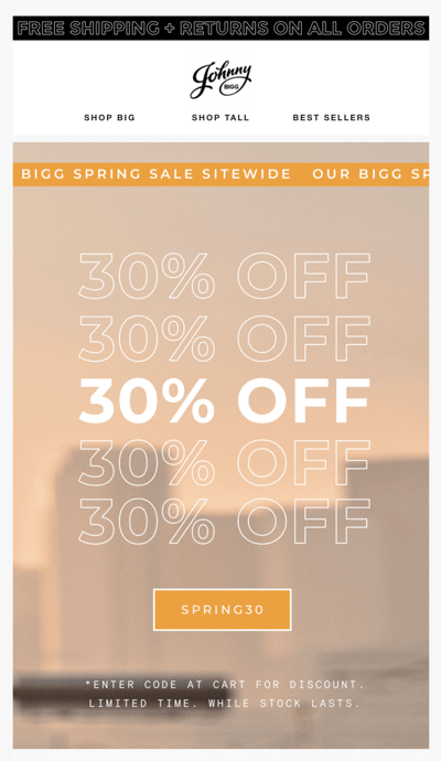
The most common size for EDM banners is 600px wide. The height is dependent on the design. E.g. are you designing a simple header? A narrow 600 x 300 px could sit at the top of your EDM.
Or perhaps you are designing a large graphic as the body of the EDM like this Johnny Bigg example.
Animated GIFs are hugely popular on social media due to the high demand in moving content. They are sometimes exported to MP4 format rather than GIF for social media, as GIF is currently not supported on Instagram - so this name is slightly misleading.
Animated GIFs are a great alternative to video content, as the stop-motion quality can be unique and captivating and it can be easier to shoot than video. All you need are a handful of consecutive shots for animating photography. You can also animate graphic elements to show movement and visual interest.
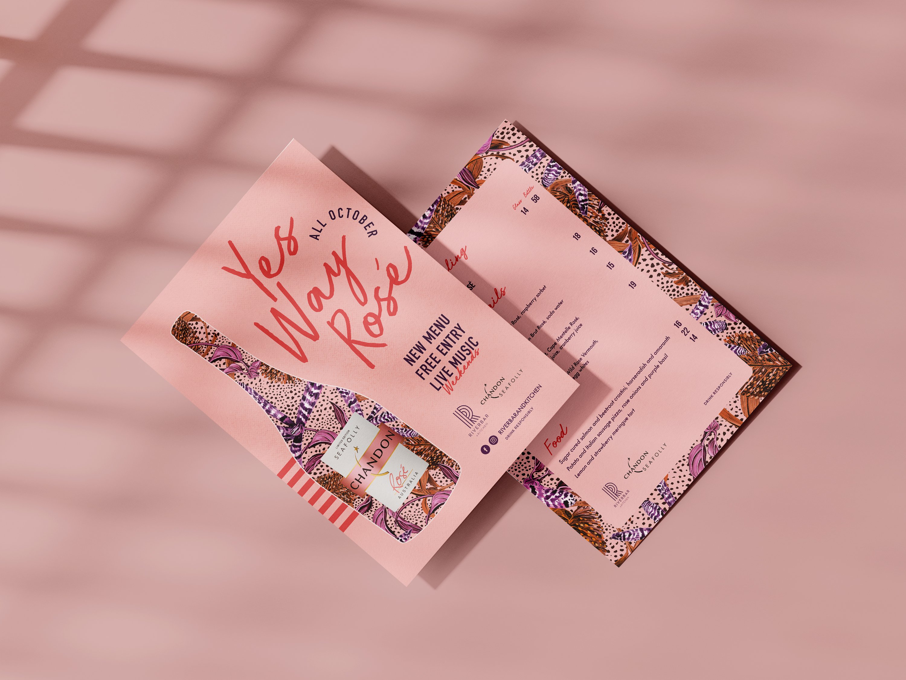
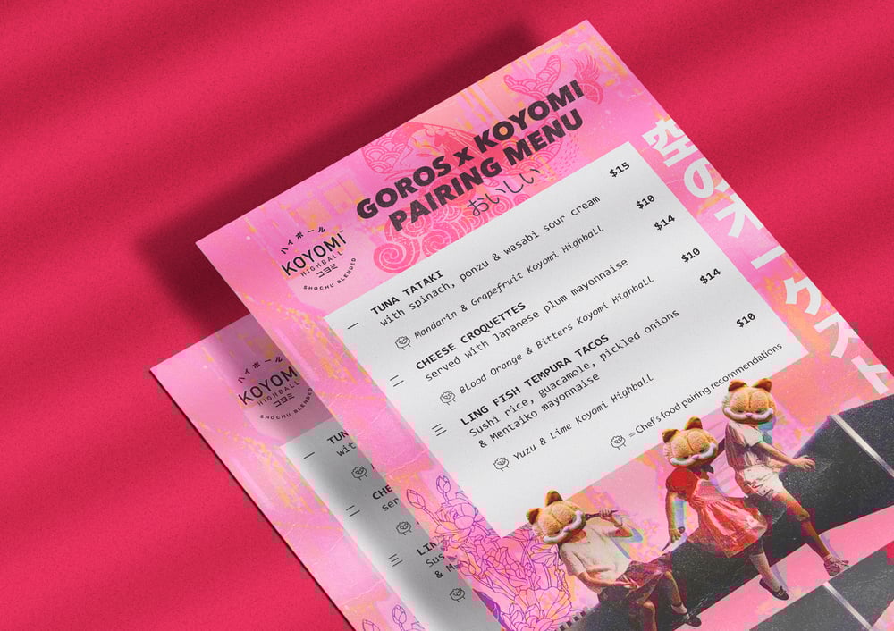
Have you ever gone to a restaurant and taken a look at the menu only to feel confused and baffled about what to order? A menu is a very important aspect of a café or restaurant but is often overlooked. It is one of the key factors that influence how much people are willing to spend and whether they choose to return to your establishment.
A good menu design should communicate clearly what food options are being offered and should make customers want to order. There are a number of components that require attention when it comes to designing an effective menu.
Making a good first impression can create a positive experience for customers and result in big benefits. A good impression could be anything, from the beautiful artwork on the cover page, to the funny headers that leave you giggle a little bit, to the way the menu is bound. This is where you want the personality of your brand to come across.
Typefaces can help customers identify the type of restaurant you are and the food quality you are offering. It's always a good practice to match your font choice with your brand personality.
Serif fonts generally creates a more elegant and classic feel. It is often used by fine dining and more expensive restaurants.
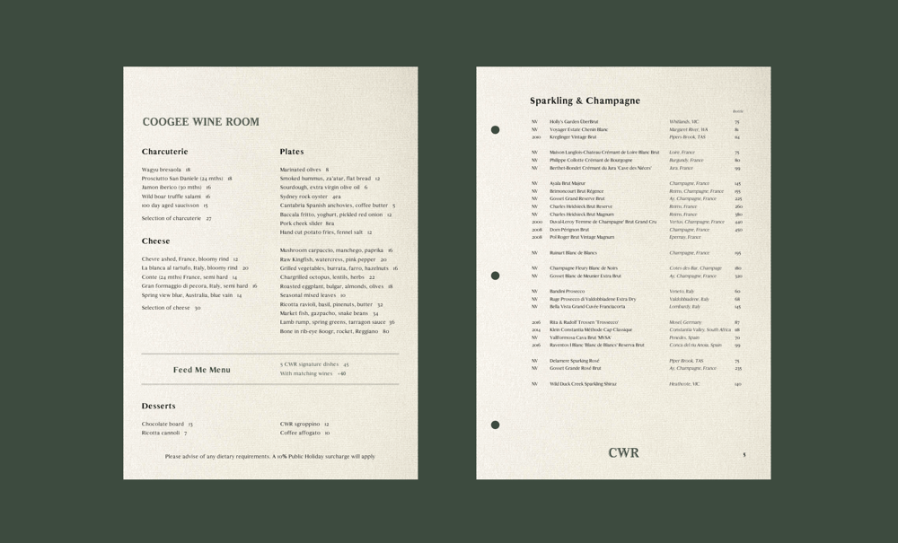
San-serif fonts are quite neutral and universal. On one hand, they are preferred by hip cafes due to their contemporary look. On the other hand, with the right treatment, they can look great on contemporary fine dining menus.
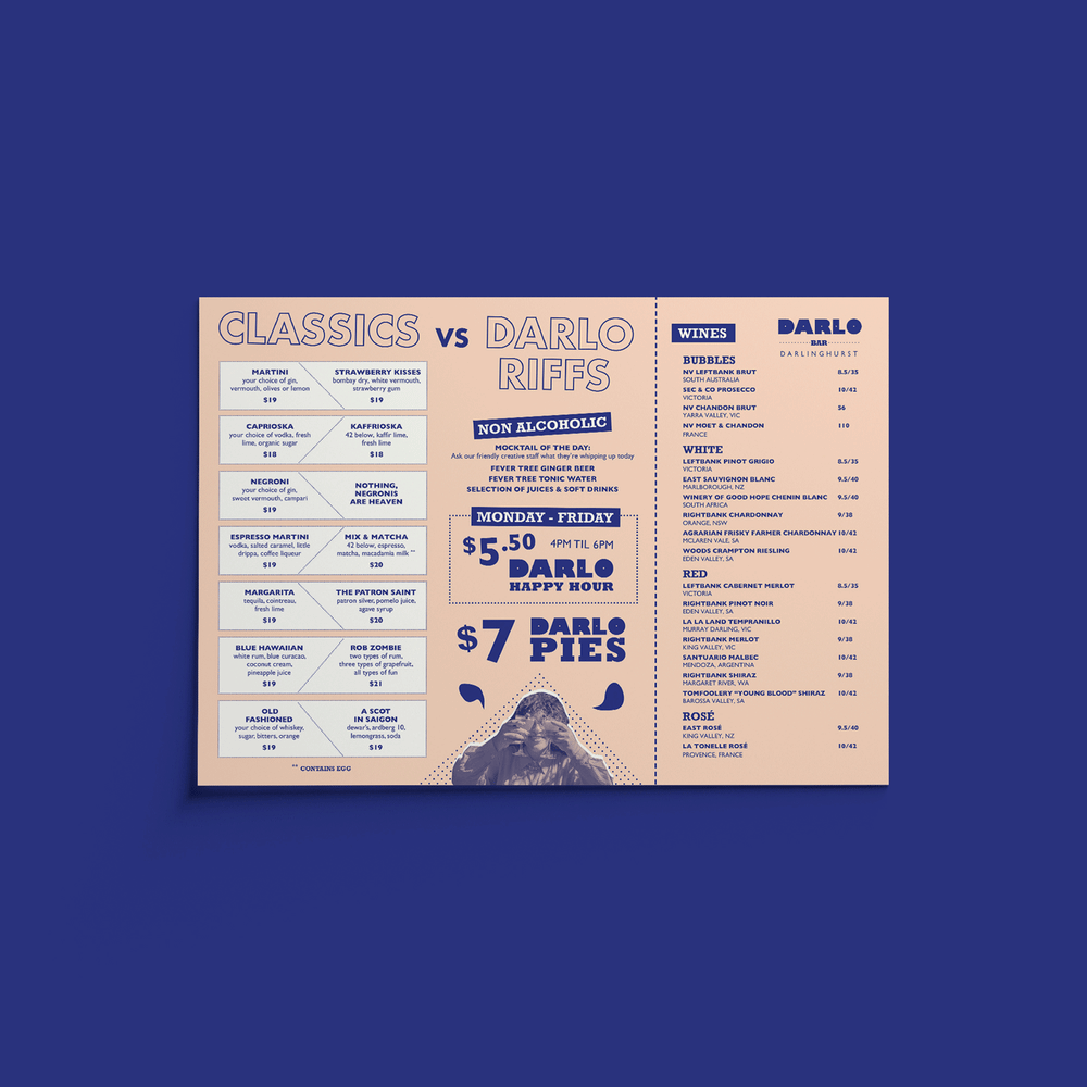
The use of certain colours can encourage and motivate specific behaviours from your customers. For example: Orange stimulates the appetite, while Green communicates nature and organic vibes. When picking a colour for your menu, it is important to understand the meaning and uses of different colours.
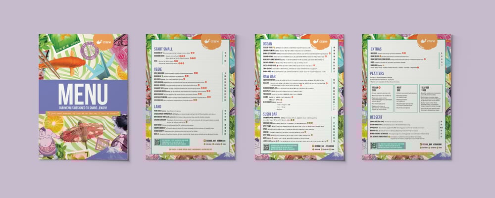
The layout of the menu is very important because it can be a key factor to determine the readability of the menu. Always make sure to have enough spaces between each section and items.
Tips: Studies have found that the top-right corner of the menu is the first thing people look at when scanning a menu. Save this area for any items you would like to promote.
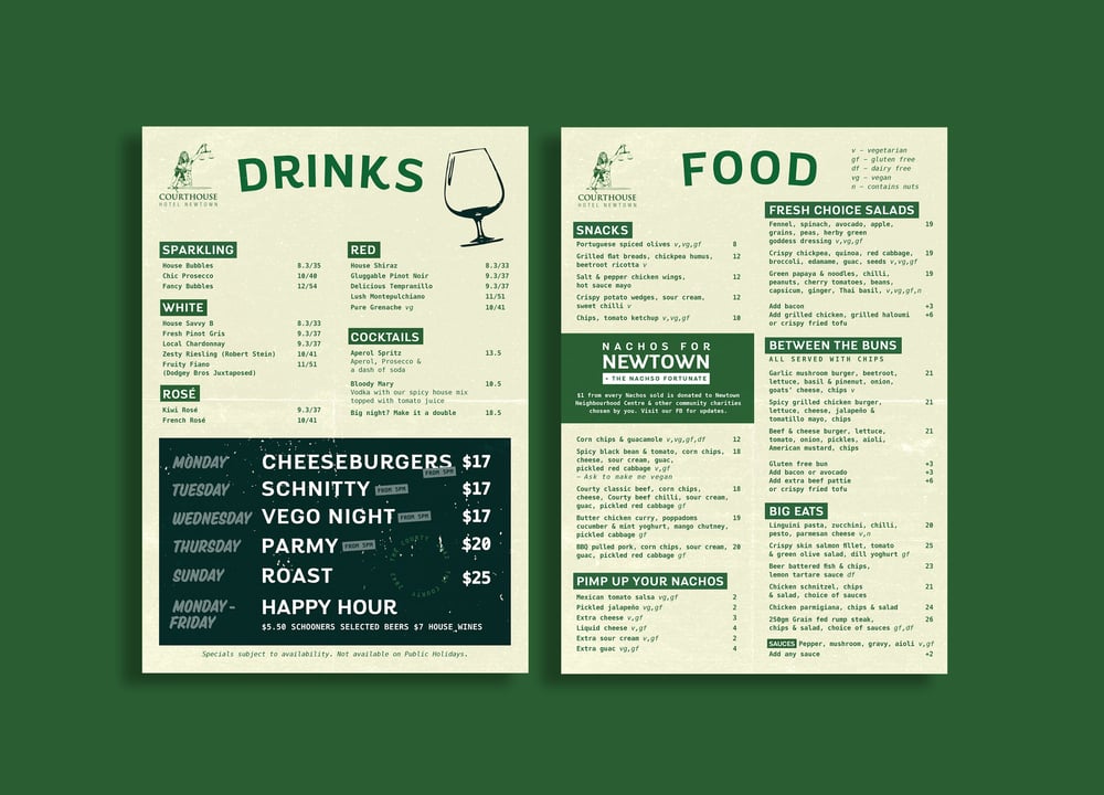
This is the aspect that should be used with caution. Images and photos, when used effectively, can be a great tool to showcase your menu items. However, they should never crowd or overwhelm the page. Too much use of images can make the menu look overly casual and unprofessional.
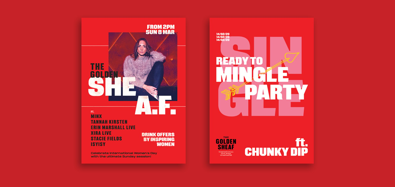
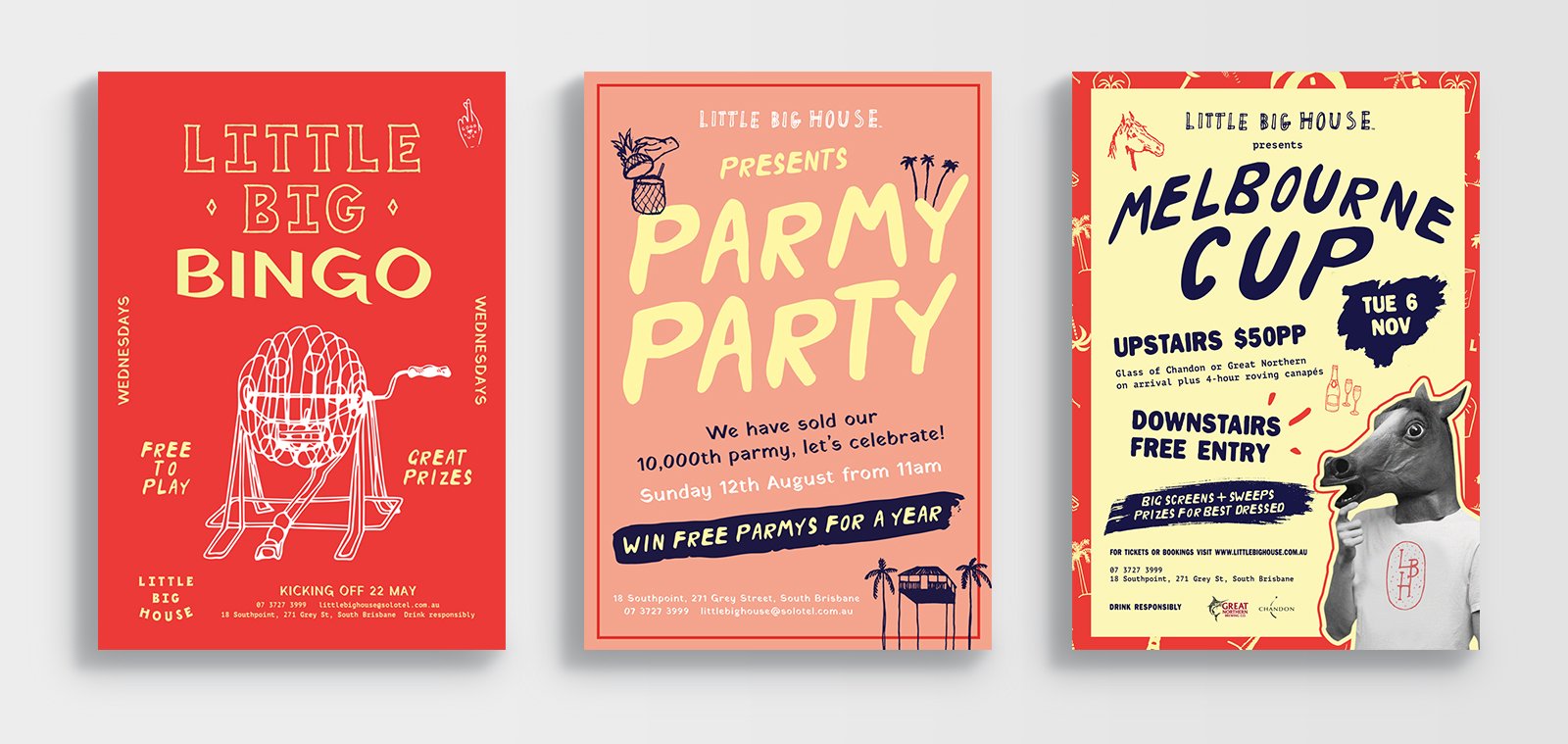
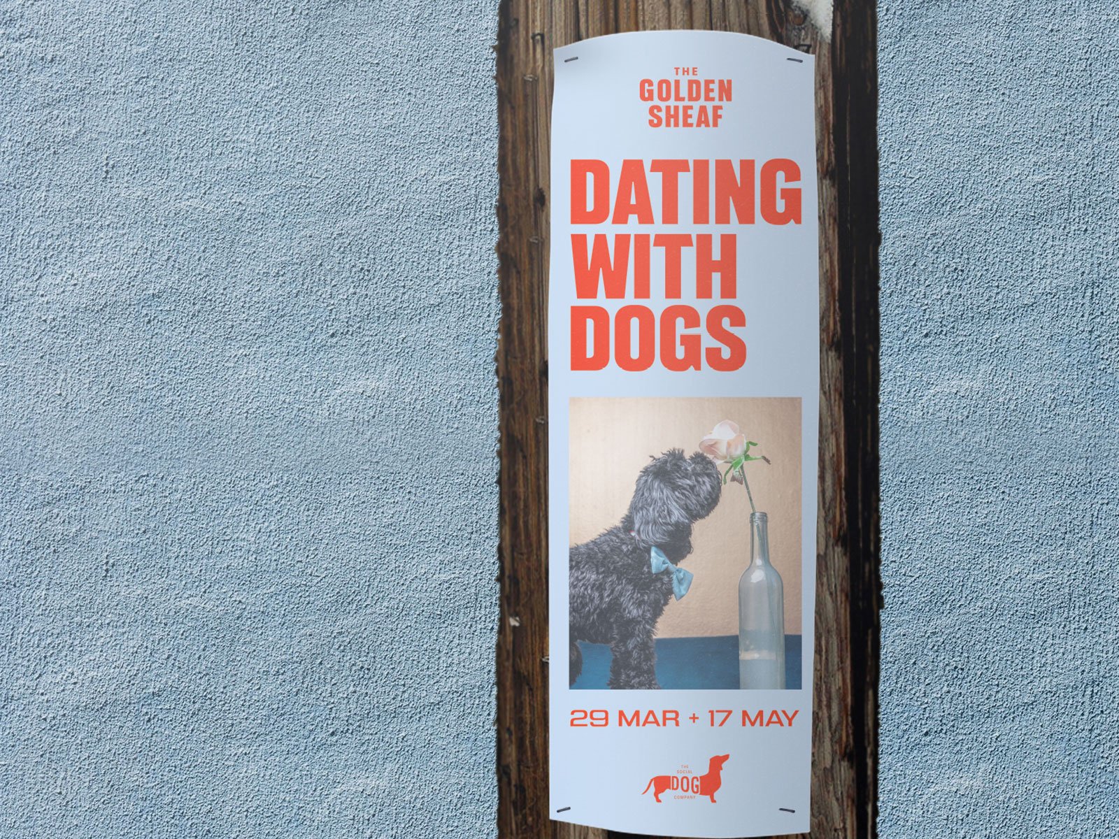
Event posters are great ways to promote your events. It is fun and effective to get your message across. Understanding your audience is the first critical key to creating an effective poster. The format of the poster can be either vertical or horizontal, but most commonly designed with a vertical orientation.
The first and main purpose of the poster is to attract people’s attention to the event. A poster should always be legible. Key information should be easy to read from a distance. It is also important to consider the environment of where the poster will be located to make it stand out and appropriate.
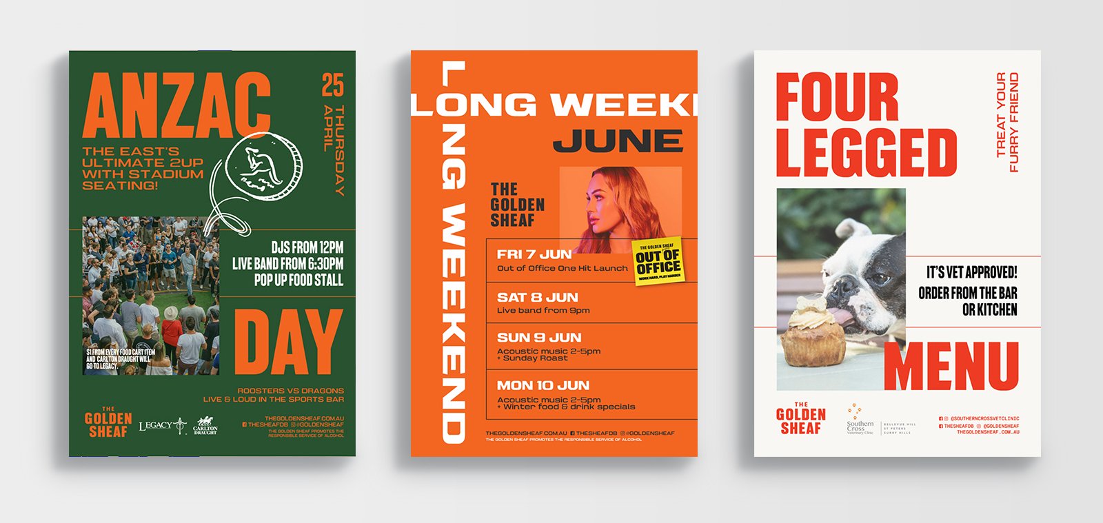
People often read from top to bottom, from left to right. Make sure to rank your information in order of importance. When it comes to event poster design, there are 4 main components:
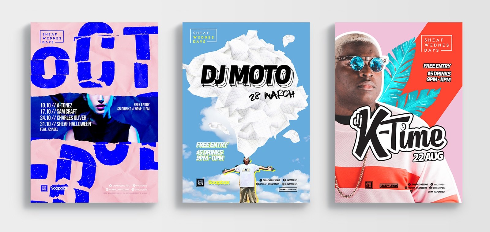
Did you know fonts have their own personalities? If you didn’t, now you do! The good news is that you can use this to your advantages. When selecting fonts, choose at least two (one for headline and one for body copy) and experiment with different options.
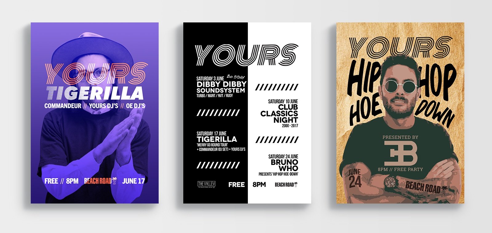
Graphic elements can be either photos or vector illustrations or typography or a combination of them. This is where you can create a point of focus that has the power to stop people when they walk pass and provoke many emotions from them. The key is to find the right balance and organise it in a way that capture the attention.
When used effectively, shapes can create interesting composition and lead viewer’s eyes in particular direction.
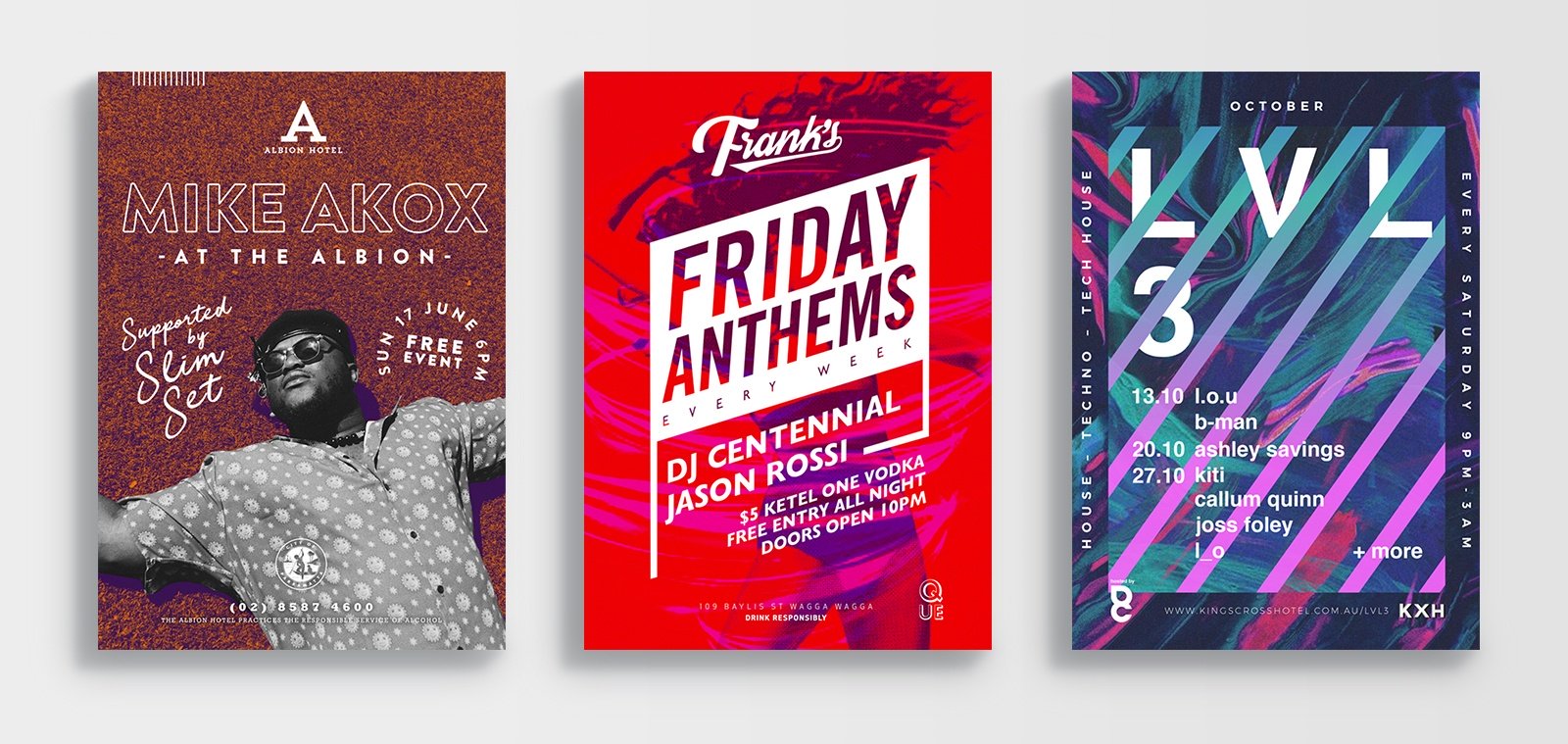
Poster design, especially event posters, is an area where designers can have a lot of fun. There’s nothing wrong with go a little crazy and stretch your imagination. So have fun and create something new!
Whether you are promoting a launch, special event or investing in some local Guerrilla Marketing to help boost knowledge about your business, pole posters are your go-to. When designed with great messaging and hierarchy, pole posters can be highly impactful and very visually stimulating.
Like the golden six second billboard rule, if you can't read what your pole poster is communicating in six seconds or less you need to condense your copy. The most common size for Pole Posters is 345mm by 1000mm (including 5mm bleed), this doesn't allow for lengthy text as more likely than not it will have to be stacked word on top of word. Key information to include would be:
This doesn't mean you can't have fun with including your branding and getting creative with layout. While you do need your text/call to action to be the star of the show, a bright contrasting colour or pattern, with a key icon or image can help your Pole Poster stand out among the rest.
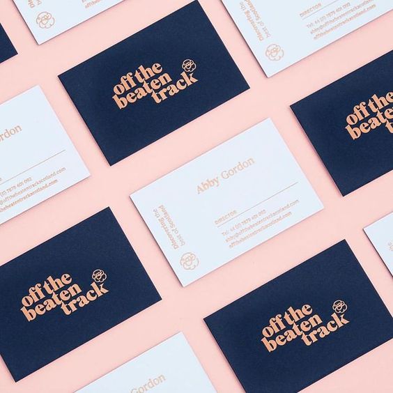
Although technology has changed our life in so many different ways, business card still remains as one of the key marketing pieces to promote your business. It is a great way to for your business to communicate your values, stand out from the crowd and encourage people to get back in touch.
Just like a menu design, the first impression of the business card is very important as it says a lot about you and your business. Your design should tie in with your core brand and fit the message. That way it will be easier for customers to recognise and connect with your brand.
It is important to know about the size and orientation of your business card before sitting down to design it. Horizontal rectangular cards (88.9mm x 50.8mm) are the most widely used format. However, you can experiment with different shapes and sizes such as die cuts, rounded corners etc. to make your card stand out more.
Make sure the fonts are big enough and legible on your card. When in doubt about how to organise your contact details, stick to the basic principles following this order:
Company name
First name and surname
Job title
Contact info (email, phone number, social media handles etc.)
Source: The Design Kids
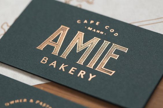
There are countless options available, including spot UV, embossing, foil accents. These finishing touches can add great impact to your design, making it more tactile, visually impressive and memorable. Different printers offer different options for finishes, so don’t be afraid to have a chat with them about what they offer.
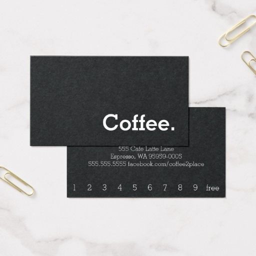
You can you the reverse side of your card for promotions or loyalty stamps. It can be a great way to more interaction with your customers and give them a good reason to come back to your venue.
By Terry Bain
Business cards: 88.9mm x 50.8mm
Postcards: 148mm x 105mm
DL: 220mm x 110mm
A5: 148mm x 210mm
A4: 210mm x 297mm
A3: 297mm x 420mm
A2: 420mm x 594mm
A1: 594mm x 841mm
A0: 841mm x 1189mm
Colours: CMYK, PMS and RGB
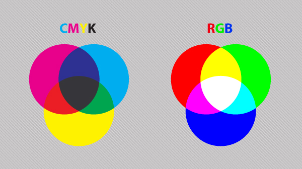
When providing print files to your printer, make sure your document is in CMYK mode. RGB colours are only used on screen and will look drastically different when printed.
If you have some specific colours that need to be precise, PMS (Pantone colours) can be another option. The best practice is to always check with the printer to be sure of their colour requirements for print.
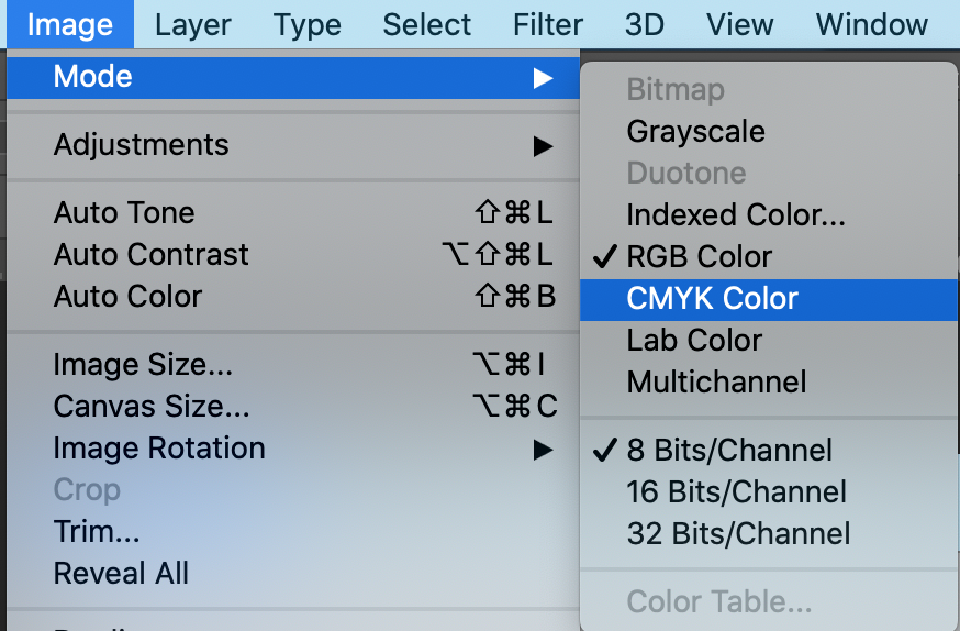
Converting to CMYK Mode in Photoshop:
Image > Mode > CMYK Color
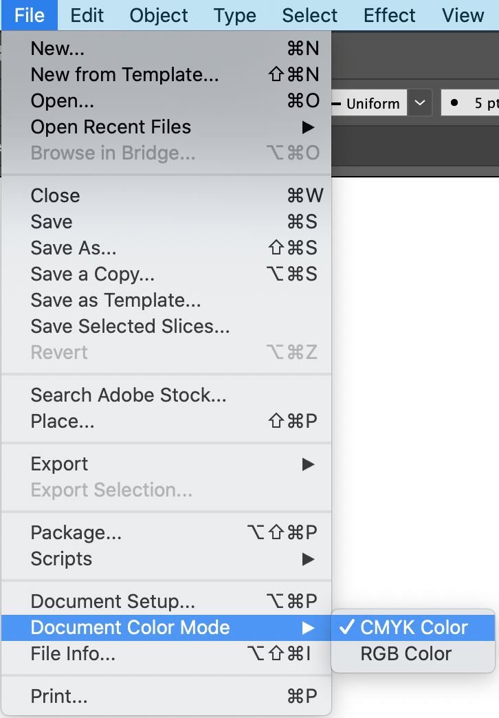
Converting to CMYK Mode in Illustrator:
File > Document Color Mode > CMYK Color
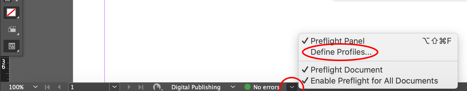
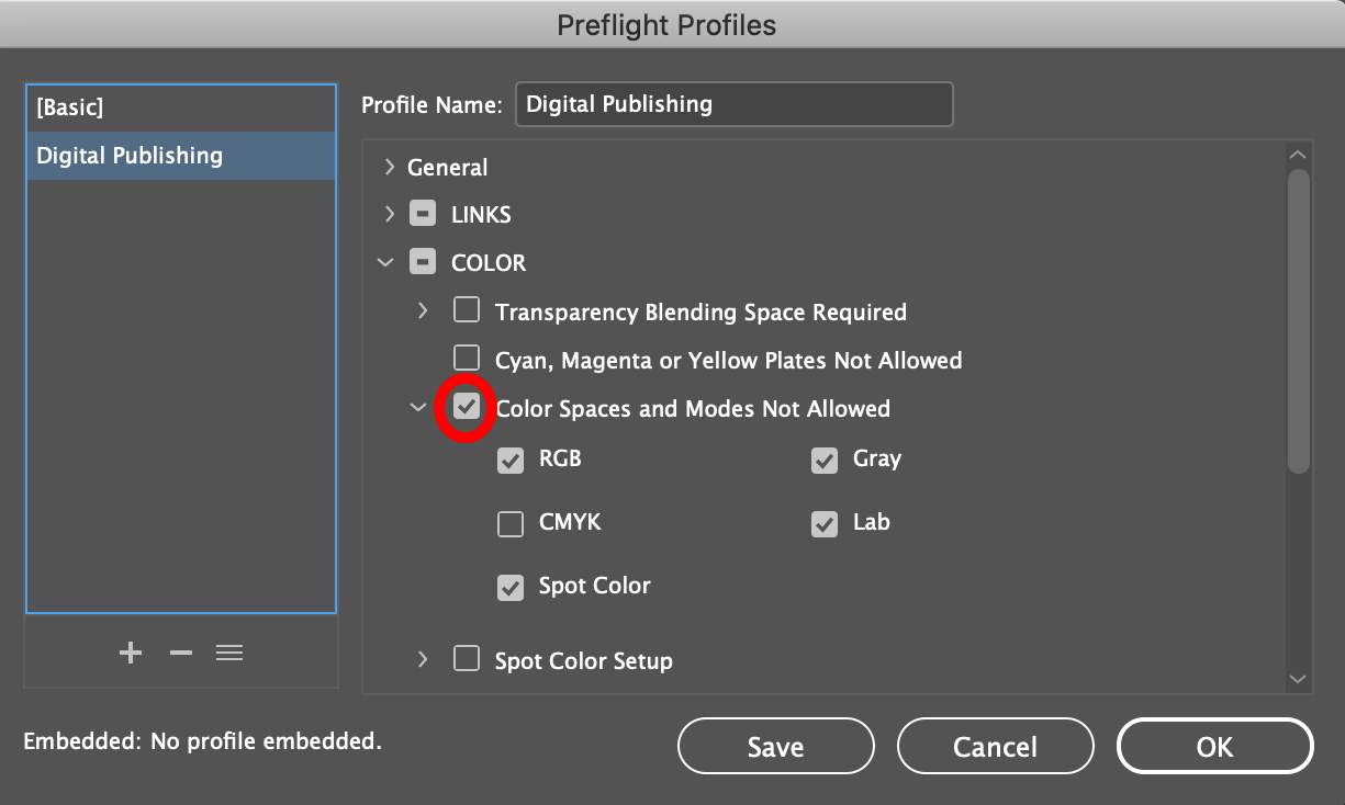
Converting to CMYK Mode in InDesign:
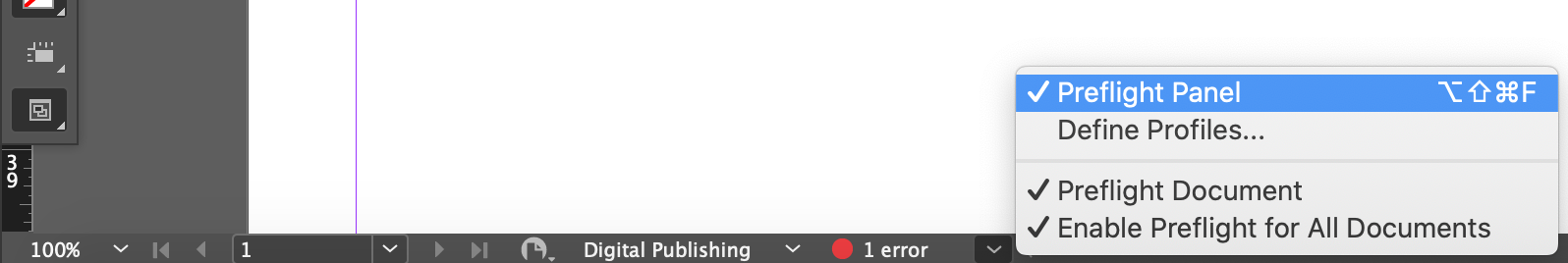
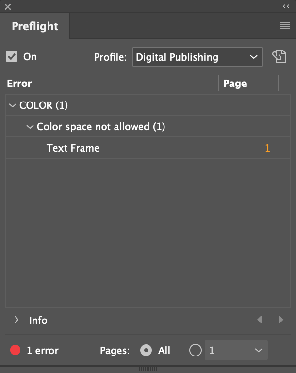
Unfortunately, InDesign doesn’t have a magic button that will convert the whole document to CMYK. But it does have a function to scan and pick any elements that are not CMYK for you. To set this up. Follow the steps below:
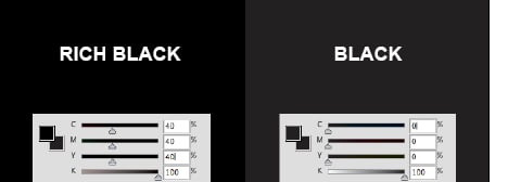
When printing with black color, there are two types of black you can use.
Black – C0 M0 Y0 100 K: can be used for body copy and barcodes.
Rich Black – should be used when creating blocks of black. Different printers may have different specifications for rich black. You should ask your printer for what they recommend.
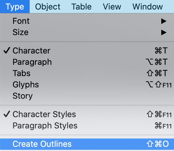
Depending on the printers and jobs, sometimes fonts will need to be outlined
when preparing print ready files. If your document was created in Photoshop, it can be as easy as providing the fonts to your printers.
If you document was created in Illustrator or InDesign, you can highlight the
text you want to outline, and select Type > Create Outlines
Make sure to include bleed and crop marks when providing your print ready files. The anatomy of a print file is as below:
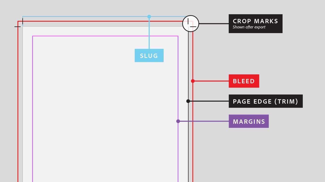
Page Edge (Trim): This is where the prints will be trimmed. Anything outside of this area will not be visible when printed.
Margin: The safe area to keep your text within.
Bleed: This is the extra area around the document that gives the printer some space for errors when printing. After trimming, the bleeds will not be visible. Any background images that run to the page edges should be extended to the bleeds. A minimum bleed should be 3mm but check with your printer about their bleed requirements.
Crop Marks: Guides for the printers of where to trim your artwork.
Want to know how we can help you and your business with our graphic design services?