<img height="1" width="1" style="display:none;" alt="" src="https://px.ads.linkedin.com/collect/?pid=2238724&amp;fmt=gif">

Doppio Doppio Coffee House

A boutique coffee roaster with a sustainability focus.

Distil Packaging Design Doppio Doppio

Double Flavour.
Double Taste.
Double Feeling.

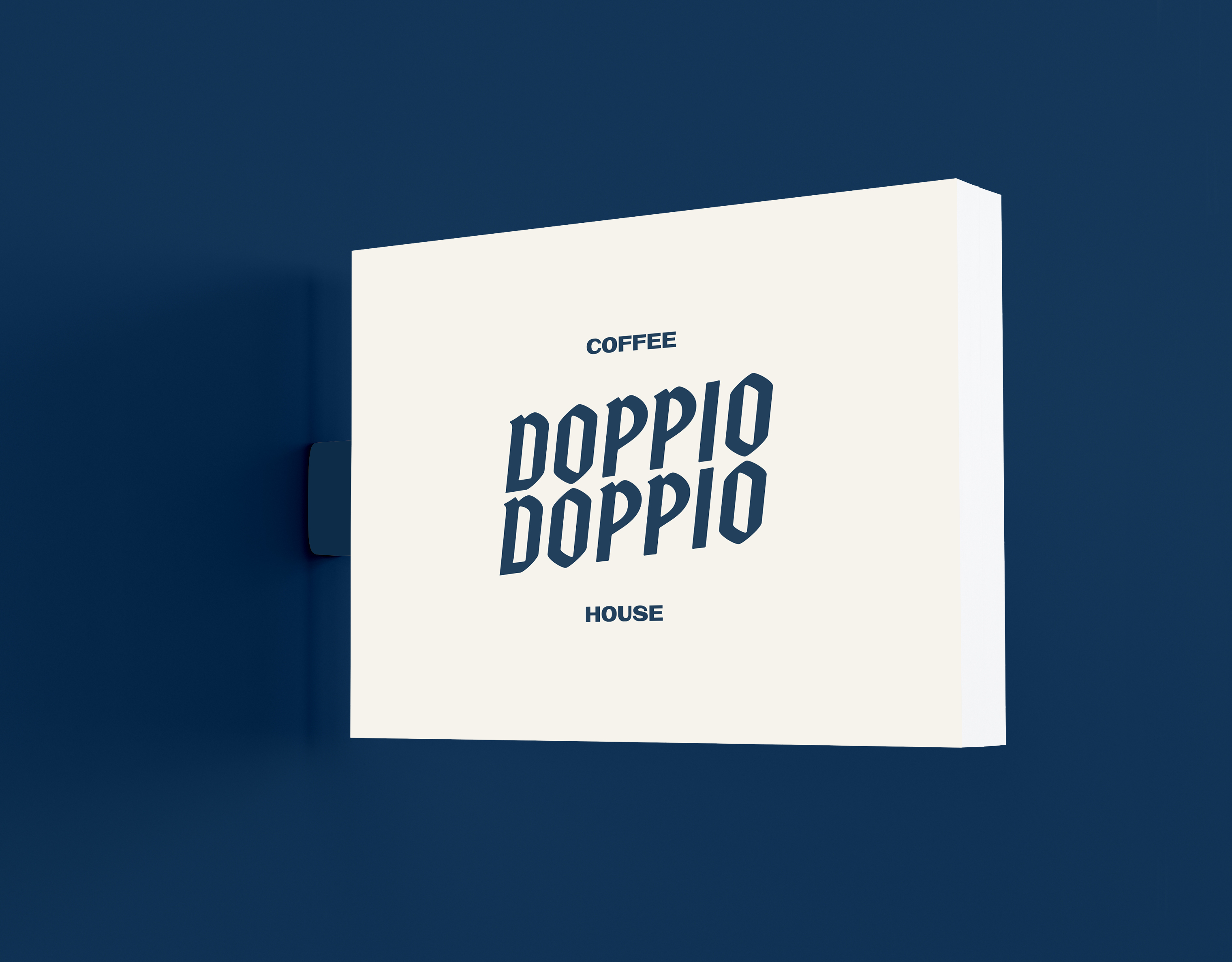
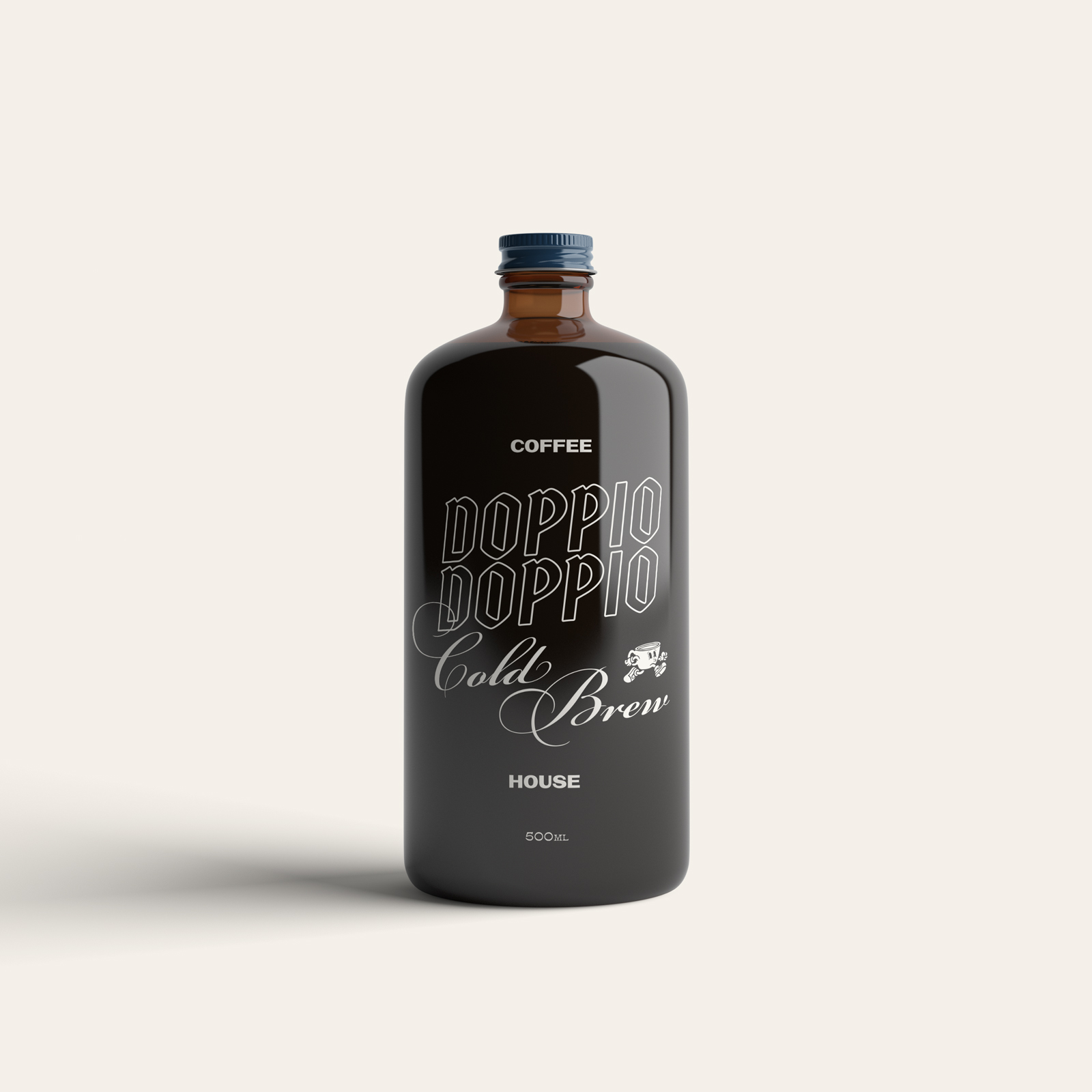
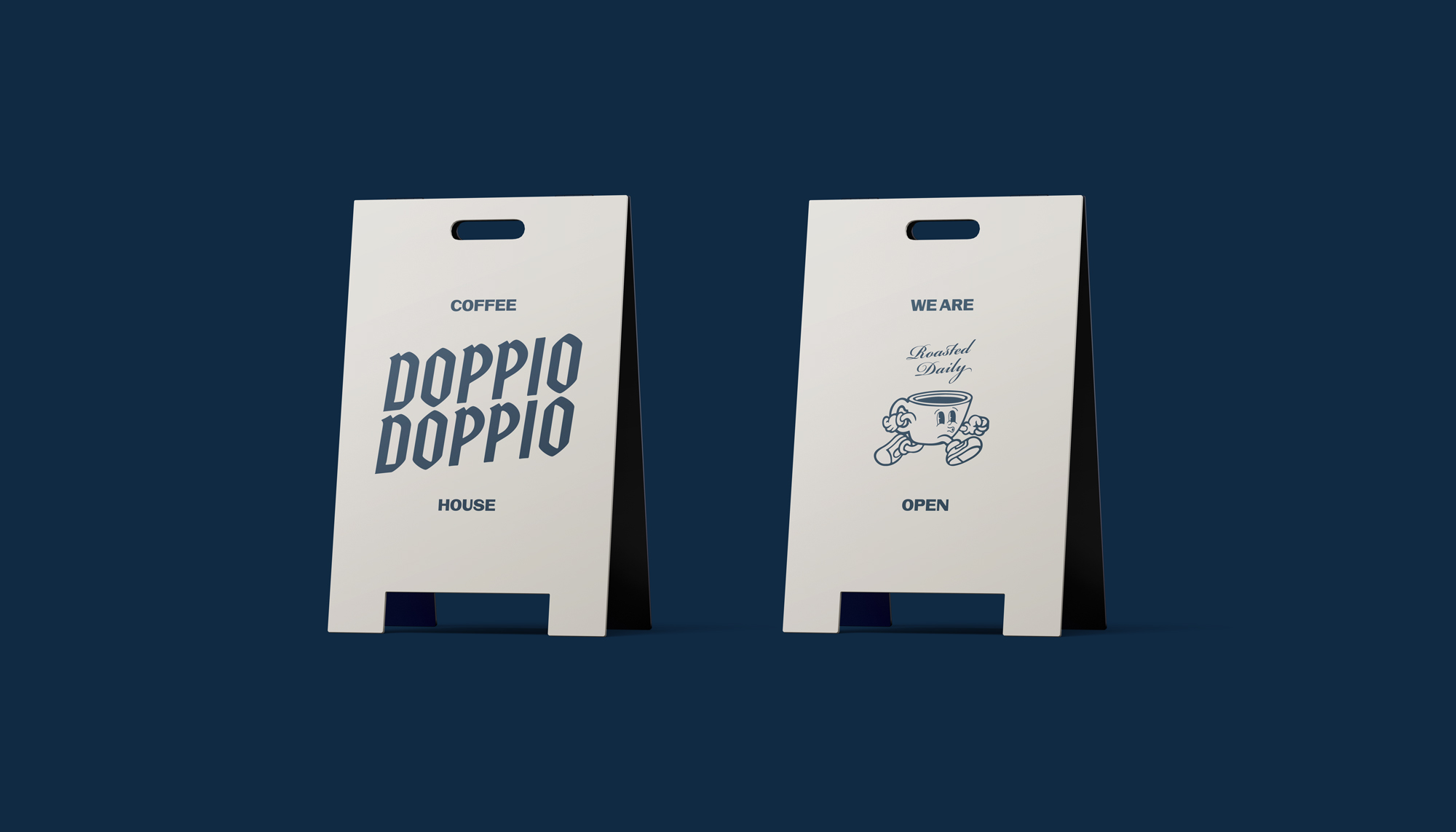
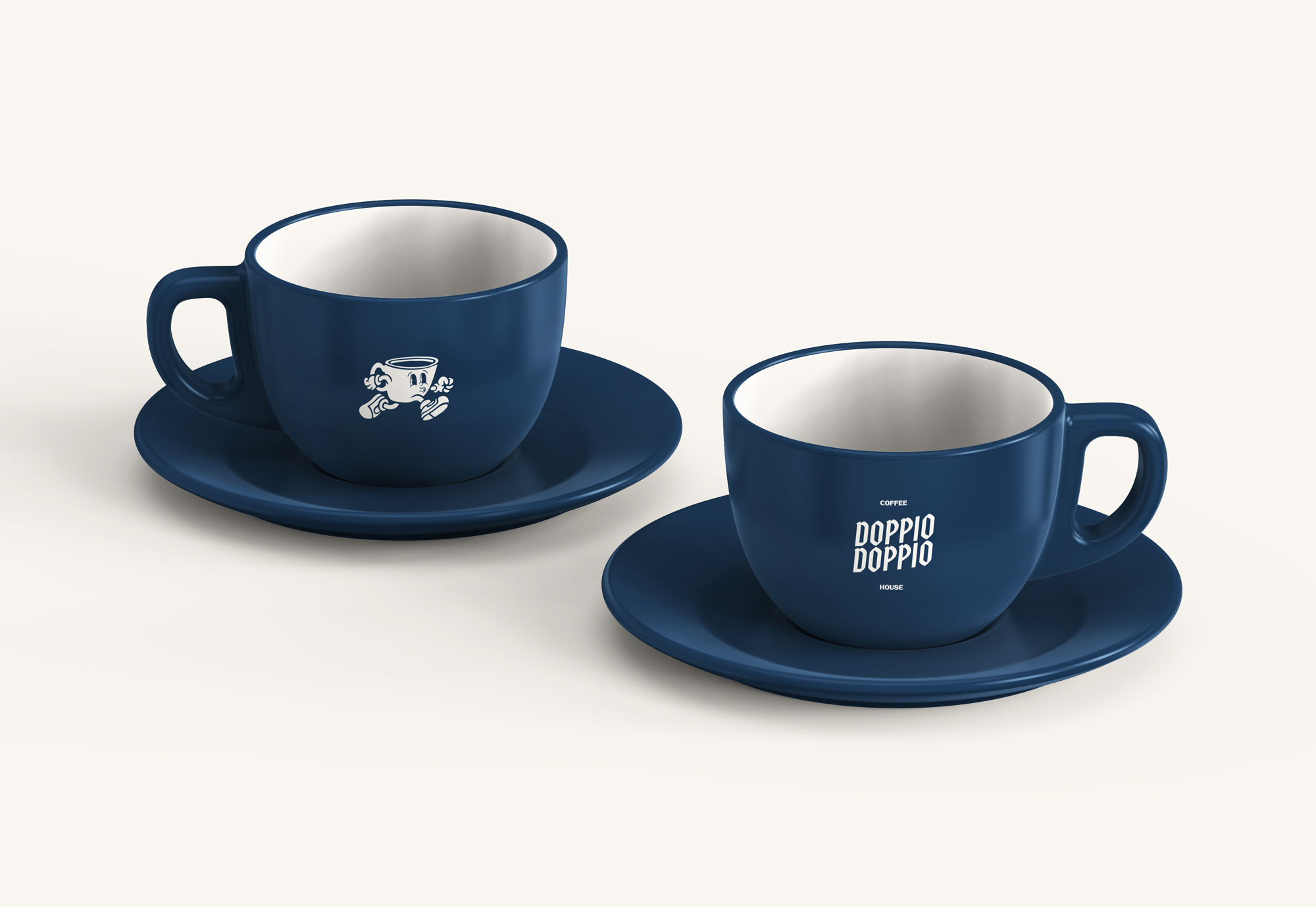
adjective (or adverb)
DOP·PIO, DOPPJO

A double shot which is extracted using double the amount of ground coffee in a larger-sized portafilter basket. This results in
60 ml of drink, double the amount of a single shot espresso.

Doppio is Italian multiplier, meaning “double”.

It is commonly called a standard double, due to its standard in judging the espresso quality in barista competitions, where four single espresso are made using two double portafilters.

Packaging Design by Distil Agency

Brief:

Create a brand name and logo for a boutique coffee roaster with a sustainability focus.

Solution:

Like its namesake, we aimed to develop a brand that promoted a quality coffee experience and a high standard of eco friendly touch points (eg. packaging, merchandise). The running 60ml coffee house mascot emulates the energy and forwardness of Doppio Doppio while the typeface is suggestive of timeless cafe corners gone by (or still standing). 

Sustainable efforts include:
- In-house disposable coffee cup bin
- Recycled Paper Menus and Coasters.
- Refillable Cold Brew Glass Bottles
- 100% Compostable Coffee Bags
- Recycled Timber Street Signage
- Solar Powered Lightboxes
- Re-Usable Branded Coffee Mugs 
and much more.

Wayfinding Design by Distil Creative Agency

Roasted Daily.

The key direction of the visual identity was hand crafted, friendly and playful. A brand that was effortless in being able to mix and match its elements/typefaces to create new, communicable and recognisable designs for the packaging, merch or online assets.

Doppio_Sign_Board_Front
Uniform Design
In-Venue Design
App Design

Other Projects