There are thousands of typefaces available at our fingertips.
A typeface is a set of design features for letters and other characters. These letterform families of different designs make up everything we read, and each has its own unique personality.
Looking at typefaces, some can have worlds of difference between the letterforms while others may have only the smallest of variations.
Each of the classifications of typefaces have a fascinating history of how they came to live on our computers and in everything we read and write.
So, who are these letters, what makes them different, how did they come to be here and what’s special about them – what if typefaces were people?
With a long and constantly developing history, it seems only fair to look at the varying typefaces in their family tree. There are two main categories: serif and sans serif as the largest divide between any letterform. 
In this divide, letters with serifs (tails and terminals) are split from those that end in clean cut. From here, each side of the family is split into varying categories that have emerged over time.
Each typeface features varying elements of weight, contrast, roundness, height and shape, that makes it different from the rest of the typeface family.
So, if typefaces were people, they might look a bit like this:
Father Old Style
Old Style typefaces are what we associate with the first ‘Roman type.’ Old style was created between the 15th and 18th century and is the basis of the modern letterforms we know.
Father Old Style is very much a refined, moderated man, never afraid to talk you through his latest work or his carefully weighted moustache.
 Great Uncle Transitional
Transitional Typefaces are largely credited to the English printer John Baskerville, who altered old style type to suit readability and printing processes in the 18th century.
Great Uncle Transitional may look a little dishevelled, but that’s only because of his rough reception to altering classical hand-written letterforms. He is a quick-witted business man and is always open to showing you a picture of his 2 golden retrievers – Bulmer and Perpetua.
Cousin Neoclassical
Sometimes referred to as just modern Serif typefaces, neoclassical typefaces feature significant contrast in weight and a more playful approach to height within the letterforms.
Cousin Neoclassical is not afraid to make herself known, she can often be found strutting her stuff on the dance floor, but is also a fan of luxury teas and a night in front of the fire with a classic novel.

Uncle Slab
Initially popularised in the 19th century for bold advertising displays, Slab serif fonts feature almost, if not completely, monotonous stroke weight and heavy serifs.
Uncle Slab isn’t super talkative, unless of course you ask him about the right things- western films and whiskey, you won’t be able to shut him up!
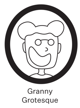
Granny Grotesque
The first commercially popularised sans serif typefaces, grotesque fonts feature squared off curves, and a monotone weight.
Granny Grotesque is not your usual grandma, she’s quirky, fun and loves to take her pet chihuahua to the peach in matching Hawaiian shirts – she is not afraid of a bold statement!
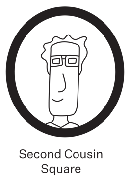
Second Cousin Square
A close descendent of Granny Grotesque, square sans serifs vary slightly from grotesque in their even more dramatic squaring of normally rounded curves as well as extended height in some circumstances.
Second Cousin Square isn’t at every family event, normally because he is travelling to 3D film festivals across the globe, but when he is around, he’s a pretty down to earth guy, despite his height.
 Aunty Humanistic
Featuring a strong calligraphic influence, Humanistic sans serif typefaces feature contrasting weights and proportionate shapes.
Aunty Humanistic is very much an all-rounder, she will teach you to knit and then teach you the newest UFC move – she’s not afraid of a bit of fun but she takes her work very seriously.

Uncle Geometric
Portraying strict, monotonous, geometric based lines, Geometric sans serif typefaces often resemble shapes more clearly than the rest of the family.
Uncle Geometric is a fairly solemn guy. He and his cat live in a small apartment in the city and they are never short on tea and biscuits. While he doesn’t say much, Uncle Geometric is a killer knock-knock joke teller.
Taking all this into account, as with every family gathering- there are certain members that just gel together, take Transitional Serifs and Grotesque for example, a high contrast pairing with a monotonous stroke weight, to create an interesting match that doesn’t clash.