Don't know the difference between serif & sans serif? As a marketer, it's important to know some basic design terms for when you're briefing artwork and requesting revisions. It'll make your life (and your designer's life) easier!
This is by no means an extensive glossary, but just the basic terms that most marketers will come across when working with designers and printers.
To search this page, press CTRL+F, or if you are on a mac use Command+F
A
Adobe Creative Cloud
A subscription service to a set of applications from Adobe Inc. that is used for graphic design, video editing, web development, and more.
Some of their most popular applications are: Photoshop, Illustrator, InDesign, Acrobat, Lightroom, Premier, AfterEffects.
Alignment
The arrangement of text or images in relation to the page. There are four types of alignment; centre, left, right and justified. It's usually used to create balance and order to the layout. 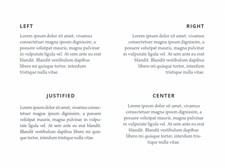
Source: Tubik Studio
Animation
Generating movement with graphics by displaying a series of images using frames. See also: GIF

Animation created by Distil for The Carrington using photographs
B
Balance
The visual balance of elements in a design, in order to achieve unity.
Bleed
The bleed is the extra space that extends beyond where you have planned to cut your page. This ensures that your finished work looks exactly as you planned for it to be, and does not have any white edges left from the paper.
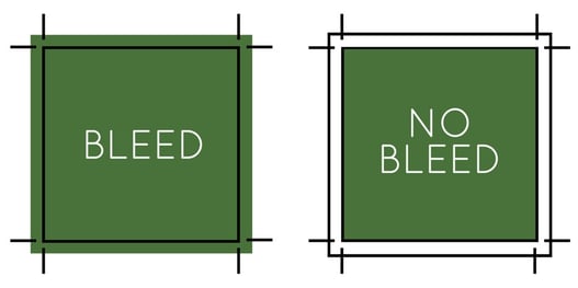
Source: The Paper Mill Store
Border
The decorative design or edge of your work. Borders are often thought about in print terms but it can also be a valuable digital design tool as well and can serve as an element to help break up different of a design.
Body Text
The body text is sometimes also known as the body copy and it is the text that form the main content of a design, digital work or web page.
Brand Identity
A brand identity consists of all the visual or tangible elements that represent a company's image. It is how you shape and create an impression that make the company recognisable.
C
CMYK
Also called process or 4-colour, CYMK stands for Cyan, Magenta, Yellow, and Black which are the four inks that are printed together to create colourful images.
Colour Palette
In the digital world, a colour palette refers to the full range of colours that can be displayed on a device screen or other interface. It is the combination of colours being used by designers.
Contrast
Contrast helps organise your design and adds visual interest. It is the difference between two or more elements in a composition of a visual design.
Copy
In contrast to the visual elements of a design the copy is the written material.
Crop
To crop means to remove the unwanted areas of a photographic or illustrated image. It can be achieved by designers through using image editing software.
Crop Marks
These can also be called the 'trim marks' and are lines printed in the corner's of your publication's sheet or design to show you where to crop the paper. They're used by commercial printers for creating bleeds where an image or colour on the page needs to extend.
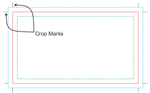
Source: Alpha Graphics
D
Die Cut
Die cutting is a material-shaping process. It is done on either on flatbed or rotary presses where flat goods are cut or distorted by a sharp metal edge. It is then pressed into the stock to be cut and shaped in a specific way.
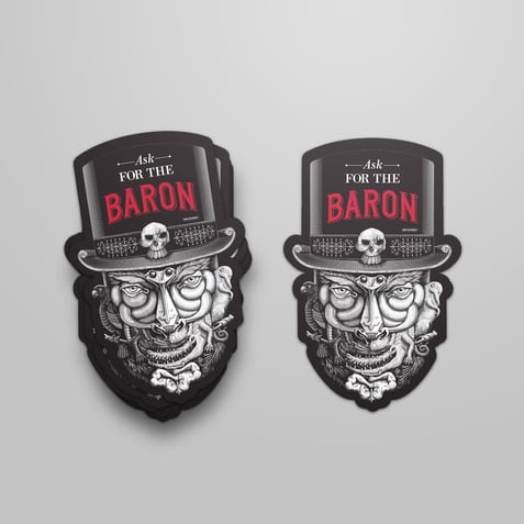
Die cut sticker designed by Distil for Campari Group
Double Page Spread
A double page spread refers to any one design that covers two pages. The layout is often featured in the centre of a magazine or a menu for example and covers both pages facing each other.
DPI
DPI stands for dots(or sometimes pixels)-per-inch and is used in printing terms to describe the number of dots or pixels that fit into one inch of space.
E
Element
Graphic design is the art of combining visuals with text and ideas to create a beautifully crafted work that communicates a specific message. In order to do this, you'll need the seven basic elements which graphic design are line, shape, colour, texture, type, space and image.
Emboss
Embossing is a process used in print making and is simply raising the surface of your design so that it has some depth. Its a great way to give your design another dimension.
Embed
When you embed something, you insert it into your design. Embedding refers to the integration of links, images, videos, gifs and other social media posts or web media. If something is embedded it appears as part of the design and supplies a visual element.
EPS
EPS is a file format that stands for Encapsulated PostScript. It is a vector format designed for printing to PostScript printers and imagesetters. It is considered the best choice for graphics format for high resolution printing of illustrations.
Export
To export a file means to permit a user to save a file in a different format in order to open it in a different program.
F
Focal Point
They are the centre of focus of a design and are areas of interest, emphasis, or difference within a composition that capture or hold the viewer's attention. Focal points are the point to which all elements or aspects converge.
Font
The font is the choice of lettering and shaping a designer users to put text on their work. Fonts are varied in shapes and sizes and a good one, gives an edge to a work. Helping the designer convey their message more clearly.
See also: 'typeface'
G
GIF
GIF stands for Graphics Interchange Format. It is a series of images or soundless video that will loop continuously and doesn't require anyone to press play. The image file format is commonly used for images on the web and sprites in software programs.
Gradient
Gradient is also known a the colour transitions of a design and are a gradual, blending form one colour to another. Gradients add depth and dimension to a design.
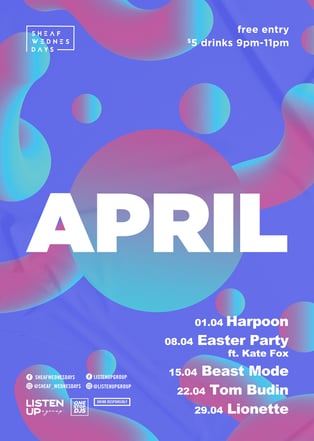
Poster featuring gradient design by Distil for The Golden Sheaf
H
Header / Heading
Header is the top section of a web page or page layout. The whole space above. the fold of the homepage is considered a header.
Hierarchy
Hierarchy is the control of visual information in an arrangement or presentation of which is most important. Designers use it to influences the order in which the human eye perceives what it sees. It is done by manipulating characteristics. For example, size - users will notice larger elements more easily.
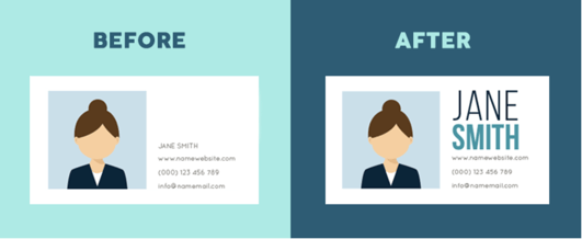
Source: Visme
High Resolution
If a design is of high resolution it is of high quality. The higher the resolution the more pixels per inch (PPI) resulting in more pixel information and creating a crisp, clear image.
I
Italic
Italics are used for emphasis. It appears in a slanted font and is used when a designer wants a word to stand out. It is different to bolding a word because it doesn't jump out.
JPEG
JPEG stands for Joint Photographic Experts Group. It is the standard image format for containing compressed image data. It is the most common file format for photo storage.
Justification
Is the structuring of the text to align with the top, bottom, sides, or middle of text or graphic elements on a page with no rag on either side.
K
Kerning
Kerning is the spacing between individual letters or characters and the process of adjusting the space between letters or characters. Kerning increases the legibility of a word or a entire block of text.
See also: 'Leading' and 'Tracking'
![]()
Source: Rightpoint
L
Layers
Layers are overlapping components of an image or sequence. They're the different levels at which one can place an object or image file. They can be stacked, merged or defined when creating a digital image.
Leading
Pronounced 'ledding,' it is a typography term that refers to the space between two baselines of text. it is typically measured in pixels, while line spacing is measured as a ratio of the default line height.
![]()
Source: Creative Market
Lowercase
Lowercase letters are the non-capital letters of the alphabet. They make up the bulk of the body, with uppercase or capital letters used primarily to start sentences or proper names.
Low Resolution
You guessed it! The opposite to high resolution. Low resolution images usually look pixelated or blurry and are of low-quality. The only time they can usually be used for graphic design is for the web.
M
Margins
Very similar to the margins you were taught not to write in at school, a margin is the space between the edge of a page and the content within it. The space ensures the that after the product is trimmed, the content is not cut off or too close to the edge.
Mock Up
A mock-up is a realistic, normally 3-D model of a design thats used for product presentations or other purposes. They are used to show how an entire campaign roll-out would look.
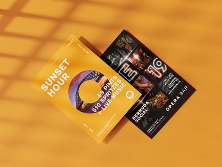 A mock-up of two Opera Bar posters designed by Distil
N
Negative Space
Negative space is also referred to in design as 'white space' and put simply, it is the space between parts of a design or the empty space/ blank areas.
O
Opacity
Pronounced 'o-PASS-ity' it refers to the opaqueness of an object. The more transparent an image is the less opaque or opacity it is in graphic design.
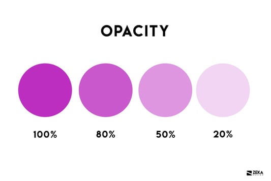
Source: Zeka Design
Outline
An outline design refers to the outer edges or sketching of an object without any shading or interior details.
Overlay
The topmost layer is known as the overlay, which serves as the visible representation of the users interface panel.
P
Pantone
Is a colour matching system, meaning all colours combining pan and tone. Pantone allows designers to see what the colour 'orange' would look like on paper and then provide the printer with the Pantone number to ensure they got what they were after.
Yet another acronym, PDF stands for Portable Document Format. This is a specific file format which accurately aims to represent a document onscreen. It is the best file to save as if you need to exchange data while keeping the original layout and appearance.
Pixel
Pixel in design terms is the smallest controllable element of a picture represented on a screen. Each individual square is called a pixel and has the capacity to broadcast millions of colours.
PNG
A PNG a.k.a a portable network graphic is an image time most commonly used in web design. It is a file format that supports lossless data compression.
Q
Quick Keys / Shortcuts
Quick keys or shortcuts refer to the certain keys on your keyboard that allow you to carry out specific functions in a single click, rather than a longer, more drawn-out process. For example - A shortcuts to copying an expect require you to combine pressing the command ⌘ key on Mac and the letter C. Quick keys are one of the most important things for a designer to know!
R
RBG
The acronyms don't stop! Red Green Blue is the colour space for digital images. They are mixed together on screen to create the full spectrum of colors. Comparatively, CMYK ink is mixed together on paper to create the full spectrum.
S
Sans Serif & Serif
Another one for typography, sans-serif put simply is a fonts that tend to have less stroke width variation than serif fonts. Serifs fonts are fonts that have strokes at the end of the lettering. These strokes are called serifs.
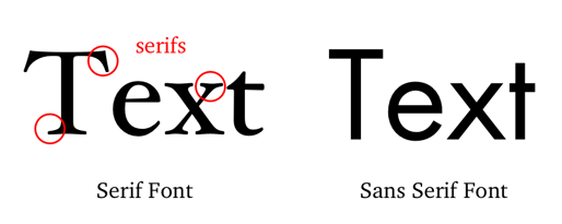
Source: Dr. Mark Womack
Saturation
Saturation refers to the intensity of colour of an image in a design. The higher the saturation, the more pure the colour appears to be.
T
Tracking
Used to describe letter spacing. This is sometimes confused with kerning - but tracking adjusts the letter spacing uniformly over a range of characters rather than individual letters.
Typeface
Typeface is typically interchangeable with the word 'font'. Your choice of typeface should work well with your layout, grid, colour scheme etc and can be the difference between a good and bad design.
U
Uppercase
Yep, you guessed it again! The opposite to lowercase. Uppercase or capital letters are used primarily to start sentences or proper names in design.
V
Vector
Vector is another design work but unlike JPEGs and GIFs vector are not made up of pixels. Instead, vector graphics are made up of paths, which are defined by a start and end point as well as other lines, points, curves, and angles. This means no matter how large or small or how you zoom in on an image, the image remains clear.
W
Watermark
Also known as a logo or trademark that is layered over an image or design with a great deal of transparency. Although it is placed over the image or design it doesn't interrupt the vision of the photo or design that it protects.
X
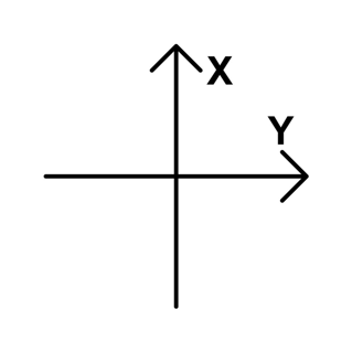
X-Axis
An x-axis is one of the axes of a two- or three-dimensional graph often used in design. The x-axis is the horizontal plane of a graph in and gives a numerical value to each point.
Y
Y-Axis
The y-axis is the vertical axis of a two- or three-dimensional graph often used in design and also gives numerical value to each point.
Z
Zip File
You finally made it to the bottom of the graphics alphabet! Congrats! Last one is another file format. ZIP is used for data archiving and compression. It contains one files that have been compressed to reduce file size and allow for easy file transfers.
Looking for more graphic design & digital marketing resources? Subscribe to our blog to stay in the loop!