A brand's style guide is just as important as a recipe for an exquisite dish. Put simply, you cannot have one without the other. Here's a look into the anatomy of a style guide and why it's necessary for a successful brand identity.
A style guide is the primary document for content creators, designers and freelancers to reference and ensure that what they are communicating is on-brand, cohesive with any existing artwork and aligns with the right audience messaging. It's a necessary tool to form your brands identity across multiple platforms.
The style guide (also referred to as a brand book or brand guidelines) acts a foundation of visual and verbal communication standards, providing a great drawing board for ideas to begin. It also helps ensure a customers experience is consistent (regardless of where, when or how) with all interactions, making a customer more inclined to align their loyalty and trust with the brand.
Stand Out from The Crowd
With 4.57 billion internet users (April 2020) and growing, it's definitely safe to say that establishing your digital brand is more important now than ever. Consistency as mentioned before is vital and style guides that reference how a brands social media, website and email marketing should look like means your content can be distinguished amongst your competitors.
They say it can take up to 7 exposures before someone becomes aware about your business/brand, so making sure that they see something that they can situate to the time before will give you a higher chance of being noticed and will resonate with your audience.
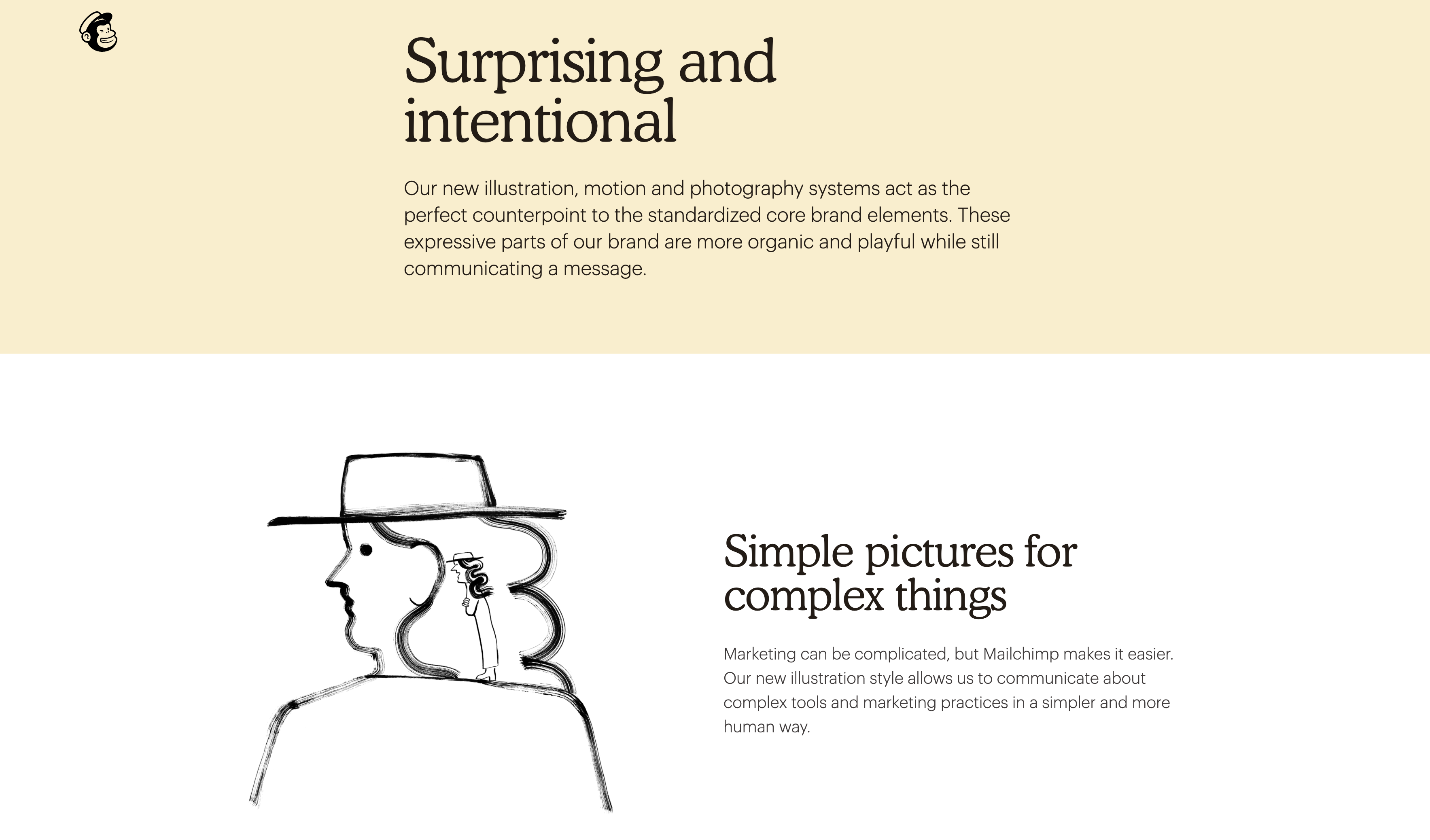
Mailchimp - Brand Guidelines (sourced via mailchimp.com/design/)
The Anatomy of a Style Guide
Creating a style guide can be daunting but spending time and utilising your resources to get it right is a must. Especially if you want to avoid that ugly stretched logo moment from happening. Below are the top three pointers any guidelines should have along with some of the greatest examples of all time.
-
Primary Logos and Variations
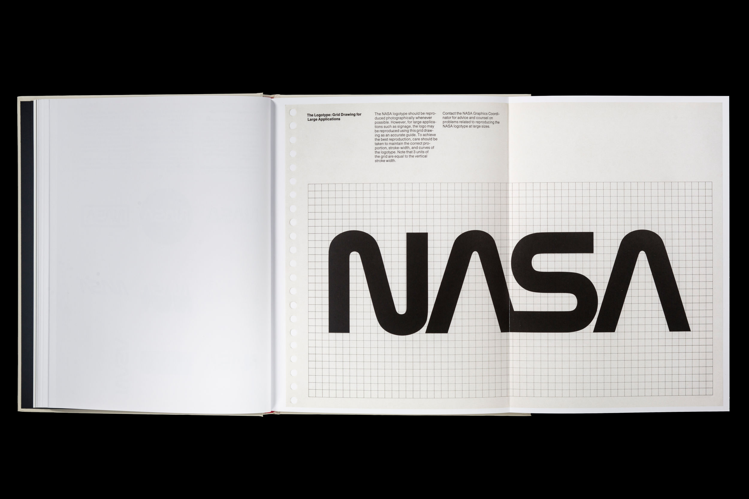
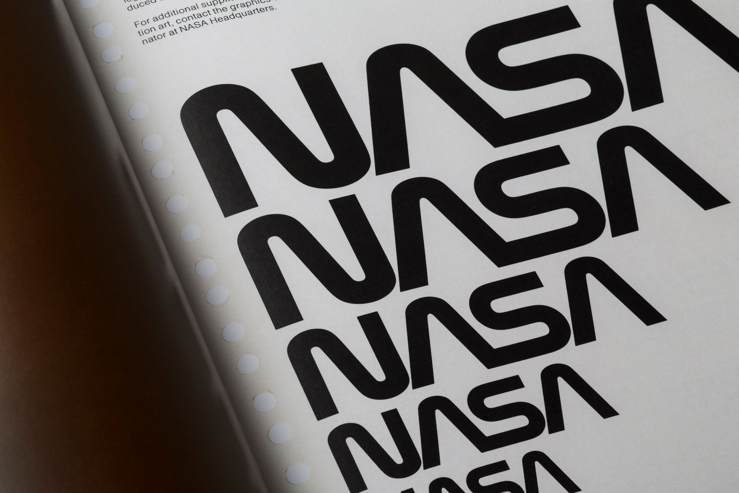
NASA - Brand Guidelines 1975 (sourced via standardsmanual.com)
Not only adding in the logo that should be used most of the time but including in any variations ( ie. icons, alternate layout), rules around minimum size, margins and of course the very vital NO STRETCHING example will convey the importance of maintaining visual structure and consistency. -
Brand Typefaces

Google - Brand Guidelines (sourced via design.google)
Including your typefaces is crucial. Communicating what weights and point size (hierarchy) can be used across different tones of voice and aspects of your brand is a foolproof way to avoid the rules being diluted and misunderstood over time. Having a web-safe example is always recommended. -
Colour Palette
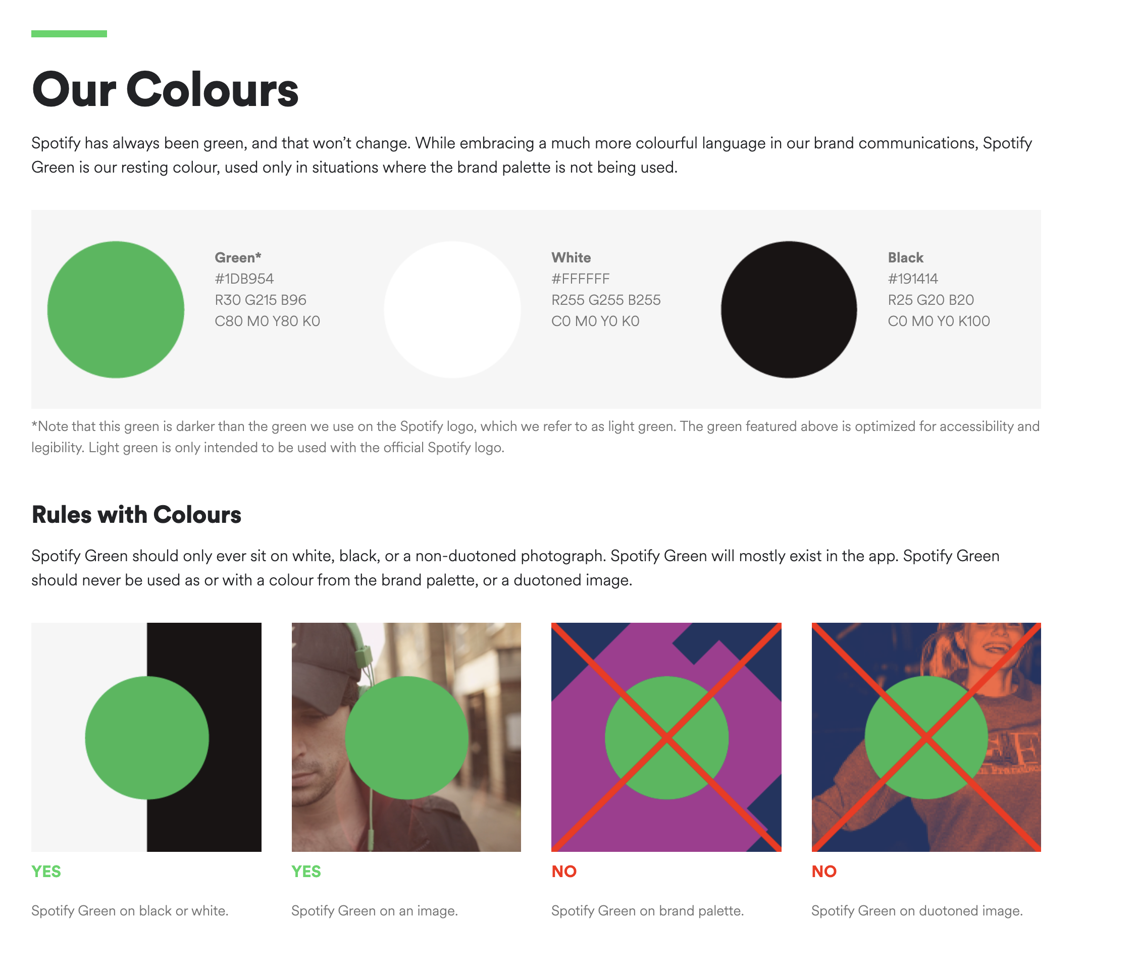
Spotify - Brand Guidelines (sourced via developer.spotify.com)
If your brand uses a bold colour, including all colour codes and Pantone swatches for it is key. Keeping the colour as close as possible across digital screens and print will ensure brand consistency especially when it can be a real identifier for the customer.
There is no doubt that style guides save time. Providing rules surrounding a brands identity and voice helps avoid confusion with anyone working on the brand internally and externally. Faster design turn around, less starting from bare bones and reduced chances of miscommunication. What more could you ask for?
Are you looking at creating your brands style guide or need to update? Get in touch with us today!